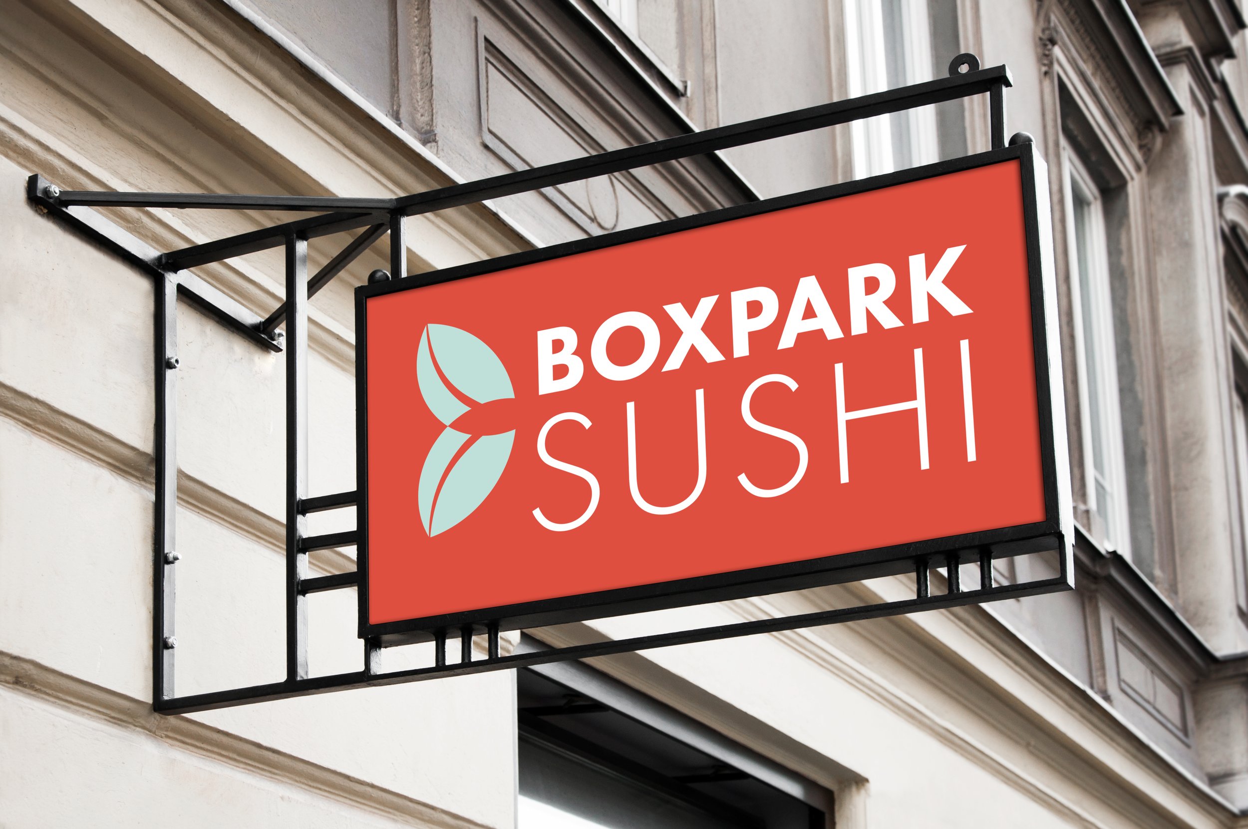
BOXPARK SUSHI
BRANDING + GRAPHIC DESIGN + DESIGN STRATEGY
Grab your chopsticks and take a bite out of this brand identity design project…
Boxpark Sushi promises to offer sustainably sourced fare that is both healthy and affordable. The owners possess a sincere care for the health of their community and the environment. This project sought to inspire people to consider what they are eating and where it came from.


Boxpark Sushi was set to open its doors in the Eastside Milwaukee area. Although several sushi restaurants exist in this location, Boxpark promises to offer sustainably sourced fare that is both healthy and affordable. This new offering comes from the owner’s sincere care and concern for the health of both the community and environment. Boxpark Sushi identified the need for responsible sourcing of ingredients by restaurants as a meaningful way to help customers live more sustainably. The restaurant desired a brand identity strategy that took inspiration from simple ingredients, honest food, and vibrant living.
THE FACTS
Boxpark Sushi will exist among a variety of competition. They strive to promote an easy-going, responsible and healthy image. They wish for their brand voice and tone to be friendly, fun and factual. The brand must stand out amongst competition while being memorable and appeal to a mixed demographic with a mean age of 29. The majority of the customer base have college degrees and are single/not married.
THE PROBLEM

01
Identify a consistent brand voice and tone that carries through all parts of the brand experience.
OPPORTUNITIES
02
Lean into an easy-going, yet thoughtful aesthetic that derives inspiration from the food and culture of Boxpark.
03
Pair copywrighting with typefaces that are familiar and friendly.
04
Utilize patterns and motifs as a way to reinforce the brand identity and visuals within the brand toolkit.

Characteristics
• Easy-going
• Responsible
• Healthy
• Clever
BRAND PERSONALITY
Voice
The voice is friendly, factual and fun. If a person, this voice would be Mike Rowe from the show Dirty Jobs (someone who has expertise but would also be fun to have a beer with).
Tone
The tone is witty with occasional humor.
Examples
Tagline:
Tastefully sustainable.
Mission Statement:
We provide sustainable sushi that is accessible and fun. We inspire people to think about what they are eating and how we got it to them. We create a space to relax and refresh yourself, responsibly.
Sample Tone:
Sushi is our art. Sustainable sushi is our passion. Come join us for fresh, relaxing fun, while enjoying some out-of-this-world sushi that is sure to leave you satisfied. We feature traditional sushi fare along with reimagined recipes that are healthy for you and the environment.

LOGO

TYPOGRAPHY
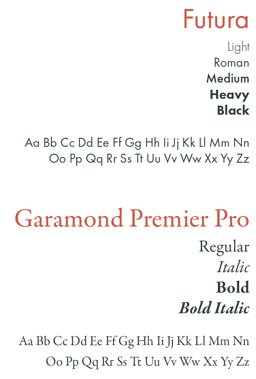
The typeface Futura was chosen because it lives up to the promise of a bright future. Historically speaking, Futura is the only typeface to make it to the moon since it was used on the plaque that still rests there. In fact, Futura represents the rational utopia of progress, where everything not only works well, but looks good doing it. This rational utopia of progress aligns with the vision, voice and tone of Boxpark Sushi.
The selection of Garamond as a type pairing was made because it is considered Michelangelo’s David to the type world. This classic typeface is one of familiarity (like Futura) as it has been used countless times in books and is the typeface used for the Google logo. This familiarity of both typefaces is key in supporting the voice of a knowledgable, friendly person that is trustworthy because these type families are like members of our own family. Additionally, Garamond offers another nod to the mission of Boxpark Sushi in that it is one of the most eco-friendly types to print because its letterforms use less ink than other similar faces.
MOOD BOARD + COLOR + MOTIFS


